
There are times when a digital artwork has plenty of colour but very little direction.
I can enjoy individual passages of texture, a translucent overlap, or the way one colour settles beside another, yet still feel that the composition is unresolved. My eye moves around the image without finding somewhere to rest. Adding more detail rarely helps. It usually gives me more things to organise.
That is often when I turn to geometry.
A circle, a triangle or a simple horizontal line gives me something definite to work with. It introduces a relationship I can see and question. Where does this shape sit? What does it hold together? Does it support the colour around it, or compete with it?
I am not trying to make the artwork perfectly ordered. I am trying to give its less predictable qualities something to work against.
Geometry gives me structure, but colour and texture give me freedom.
Why I use geometry
What draws me to geometric forms is their clarity.
A triangle has direction. A circle gathers attention without pointing anywhere. A rectangle can establish a quiet area of weight. A line can connect two parts of an image that otherwise seem unrelated.
These are simple things, but they change how I read a composition.
When I work with softer forms, almost every edge can remain open to interpretation. That can be beautiful. It can also become tiring if nothing feels settled. Introducing one clear shape reduces some of that uncertainty.
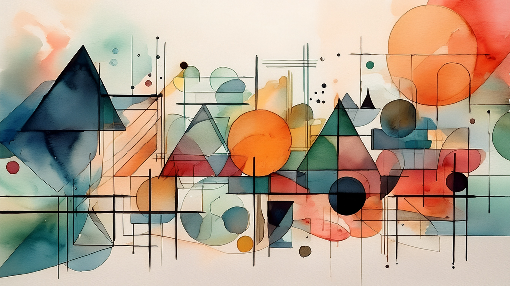
In my Chromatic Geometry Study images, dark triangles and circles provide firm points within much softer areas of colour. They are immediately recognisable, even where the surrounding washes overlap or dissolve.
I like that contrast. The shapes do not need to explain the whole image. They give me a way into it.
There is also something reassuring about returning to a limited vocabulary. With only a few basic forms, I can spend less time wondering what to add and more time noticing how the existing elements relate.
Bringing order to the composition
Once geometry enters an artwork, placement becomes as important as the shape itself.
A large triangle near an edge creates a different feeling from the same triangle placed centrally. A dark circle can pull attention away from a much larger area of pale colour. A thin line may seem minor until it crosses the composition and suddenly connects several separate forms.
I find myself looking at these relationships rather than treating each element as an isolated object.
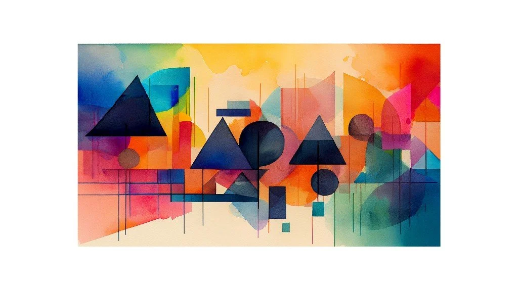
In one of the accompanying prints, three dark triangles sit across a field of orange, pink, yellow and blue. Their different sizes create a rhythm. The circles interrupt that rhythm, while the fine vertical and horizontal lines introduce another, quieter pace.
The shapes are not evenly distributed. That matters to me. Balance does not have to mean matching one side to the other.
Sometimes a small, dark form has enough visual weight to answer a larger, softer passage. Sometimes an open area does more for the composition than another shape could.
The challenge is recognising when the framework is already doing enough. I do not want every space filled or every relationship underlined.
Introducing fluidity
If geometry were the whole story, these prints would feel very different.
What interests me is what happens around and within the shapes: translucent colour, uneven edges, watercolour-like bleeding and areas where one form becomes difficult to separate from another.
A circle gives me a clear boundary. Texture allows that boundary to become less certain.
In the more detailed Chromatic Geometry Study, the orange circles are strong focal points. Yet their colour is not mechanically uniform. There are shifts in tone and visible textural variations. Around them, fine black lines cross pale washes, while blue-green and coral areas move through the framework.
That mixture keeps the image from feeling sealed.
Working digitally gives me considerable control, but I do not want that control to become the most noticeable quality of the finished piece. I want the colour to retain variation. I want some edges to feel less resolved than others.
An overlap can be particularly useful. When translucent colours meet, they create a relationship that neither colour has alone. A geometric form may remain readable, but its character changes as another layer passes across it.
For me, that is where the work becomes more interesting. The framework remains, but it no longer determines everything.
Knowing when to break the rules
Structure can solve a problem and then become a problem of its own.
The danger is not always obvious. A composition can look tidy and still feel lifeless. Shapes may be carefully spaced. Lines may align. Colours may be distributed with apparent balance. Nothing is particularly wrong, yet there is little reason to keep looking.
This is the point where I have to question my own desire to resolve everything.
If each triangle has an equally clear edge, does the repetition become too predictable? If every line reaches a neat stopping point, does the image feel overmanaged? If every area carries similar detail, where can the eye pause?
My instinct can be to correct an awkward relationship. Sometimes that is necessary. But sometimes the awkwardness is the part worth keeping.
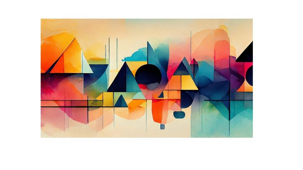
I might let a wash extend beyond a shape, allow an overlap to obscure an edge, or interrupt a repeated alignment. These are small decisions. They do not require dismantling the composition.
Nor do I want to add irregularity simply to make the work look spontaneous. An uneven edge is not automatically expressive. It still has to belong.
What I am looking for is a useful disturbance: something that loosens the framework without making it disappear.
What experience has taught me
The most useful lesson has been that structure and freedom are not opposing choices.
I do not have to decide whether a piece will be controlled or expressive before I begin. Much of the work lies in adjusting the relationship between those qualities.
When an image feels scattered, I look for an anchor. When it feels rigid, I look for somewhere to loosen it. That might mean changing a shape, reducing a line, allowing more colour variation, or leaving an area alone.
It also means accepting that adding something is not always the answer.
A digital workspace makes revision easy to continue. There is always another adjustment available. Learning when to stop is less straightforward. I try to notice when a change is helping the whole composition, rather than merely making one small part more polished.
These geometric prints remind me that a few clear decisions can create room for less predictable ones.
The triangles, circles and lines give the colour somewhere to gather. The colour and texture stop those shapes from becoming too fixed. I need both, though not always in equal measure.
If I were offering one thought to another creative, it would be this:
Creativity does not always need more freedom. Sometimes it needs boundaries.
Not boundaries that settle every decision in advance. Just enough structure to help you see what the work needs next.
About the Author
Phillip J Gordon is an Australian digital watercolour artist whose work explores the intersection of architecture, nature, and abstract expression. Phillip's prints are available as instant digital downloads at PhillipJGordonDigitalArtPrints.com .
